Landing Page
A page built around a specific audience, message, and next action.
A landing page is a page built around a specific offer and a specific next action. A visitor might arrive from an ad, newsletter, creator recommendation, or search result. The page should help them understand the offer and decide whether to take that action.
In analytics, a “landing page” can also mean any page where a visit begins. In campaign planning, people usually mean the more focused page described in Unbounce’s landing page guide.
Continue the promise that brought them here 🔗
Imagine an ad promises “a client kickoff checklist for freelance designers.” If the click leads to a homepage about project management for enterprises, the visitor has to find the offer again.
A focused page can show the checklist, explain who it is for, and make the download easy. That is message match: the page continues the conversation the visitor already started.
Show enough of the offer to make it real 👀
In my SavvyCal write-up, I highlighted an interactive demo right below the value proposition. Visitors could see the scheduling experience instead of starting with a long list of features.
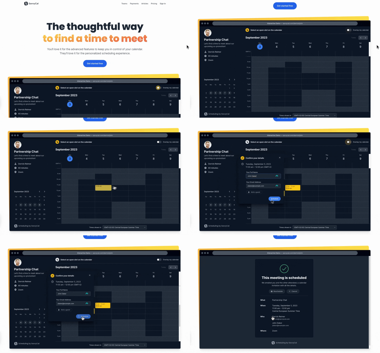
You can apply the idea without building an interactive demo. Show the actual template. Include a short product walkthrough. Put a sample report beside the button that offers a trial.
A useful visual answers a question. A decorative dashboard mockup may look impressive while leaving the visitor unsure what the product does.
What the visitor needs before clicking 🧩
- An understandable offer: who it is for and what they can do with it.
- Relevant proof: a real example, a specific customer experience, or evidence supporting the claim.
- A clear next step: a button or form whose label describes what happens.
- The awkward details: price, required setup, eligibility, or limitations that could change the decision.
The length follows those questions. A free checklist may need a short explanation and preview. An expensive product with a difficult migration may need considerably more. Remove repetition, not answers buyers need.
Follow the page through to the result 🧪
Open it on a phone. Read the headline without the ad. Submit the form. Check the confirmation message and email. Make sure the promised resource or product step is actually available.
Track the main action, then look further down the journey. More form submissions are not much help if fewer of them are qualified or if people abandon the next step.
With enough traffic, conversion rate optimization can help test specific changes. With little traffic, watching a few relevant people use the page may expose confusion faster than running an inconclusive A/B test.