Retention curve
A retention curve plots the share of a signup cohort still active over time. A curve that flattens is the usual sign of product-market fit.
A retention curve shows what happens to a group of customers after they sign up. The horizontal axis is time since signup (days, weeks or months). The vertical axis is the percentage of the group still active or still paying. A signup cohort starts at 100%. Active-user retention may rise again when inactive users return; survival retention, which excludes returns, cannot. What matters is the shape after the first drop.
How to read it
Sequoia's data science team describes the three shapes in its essay on retention.
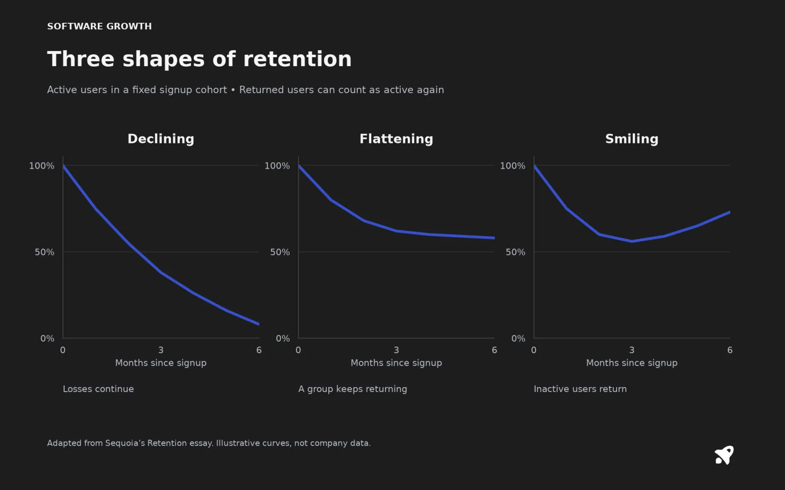
- Declining. The curve keeps falling toward zero. The product has not found a group that sticks, and the essay warns that pushing more traffic into it is a leaky bucket.
- Flattening. The curve falls, then levels off at a line above zero. The higher the level, the higher the long-term retention. A flat line means some users have made the product part of their routine, which is the usual meaning of product-market fit.
- Smiling. The curve rises after flattening, as churned users return. The essay ties this to product improvements and network effects. Seasonal products, such as tax or fitness tools, can also show it.
How to build one
A January cohort of 100 paying customers has 80 left after month 1, 68 after month 2, 62 after month 3, 60 after month 4, and 59 after month 5. The curve drops fast, then moves by about one point a month. It is flattening near 58 to 60%. If month 6 reads 45%, it is not flattening yet, it is still declining.
Why it matters more than an average
A single churn rate averages new and old customers together. A curve separates them, so you can see that most losses happen in the first few weeks. That points the fix at onboarding and activation, not at the whole product. Stack curves from different months on one chart and you can see whether your changes made newer cohorts retain better. That comparison is the core of cohort analysis. Sequoia notes early cohorts often retain better than later ones until product-market fit settles, after which newer cohorts improve.
Revenue curves
You can draw the same curve for revenue instead of customers. With expansion, a net revenue curve can rise above 100%, which is another way to see negative churn.
Common mistakes
- Declaring the curve flat from too few data points. You need several periods past the drop.
- Including free or inactive accounts in the starting count. Define the cohort the same way every time.
- Using calendar months for cohorts of different sizes without looking at the counts behind each percentage.
For small SaaS
Even 30 signups a month gives a usable curve if you wait a few months. Plot it in a spreadsheet. If it has not flattened by month six or so, put your effort into the product and onboarding before you spend more on acquisition.
Related terms
Sources
- Retention, Sequoia Capital Data Science Team
- Cohort analysis, ChartMogul Help Center
- SaaS Metrics 2.0: A Guide to Measuring and Improving what Matters, David Skok, For Entrepreneurs