Cohort analysis
Cohort analysis groups customers by signup period and tracks each group over time, showing whether retention is improving or an average hides the truth.
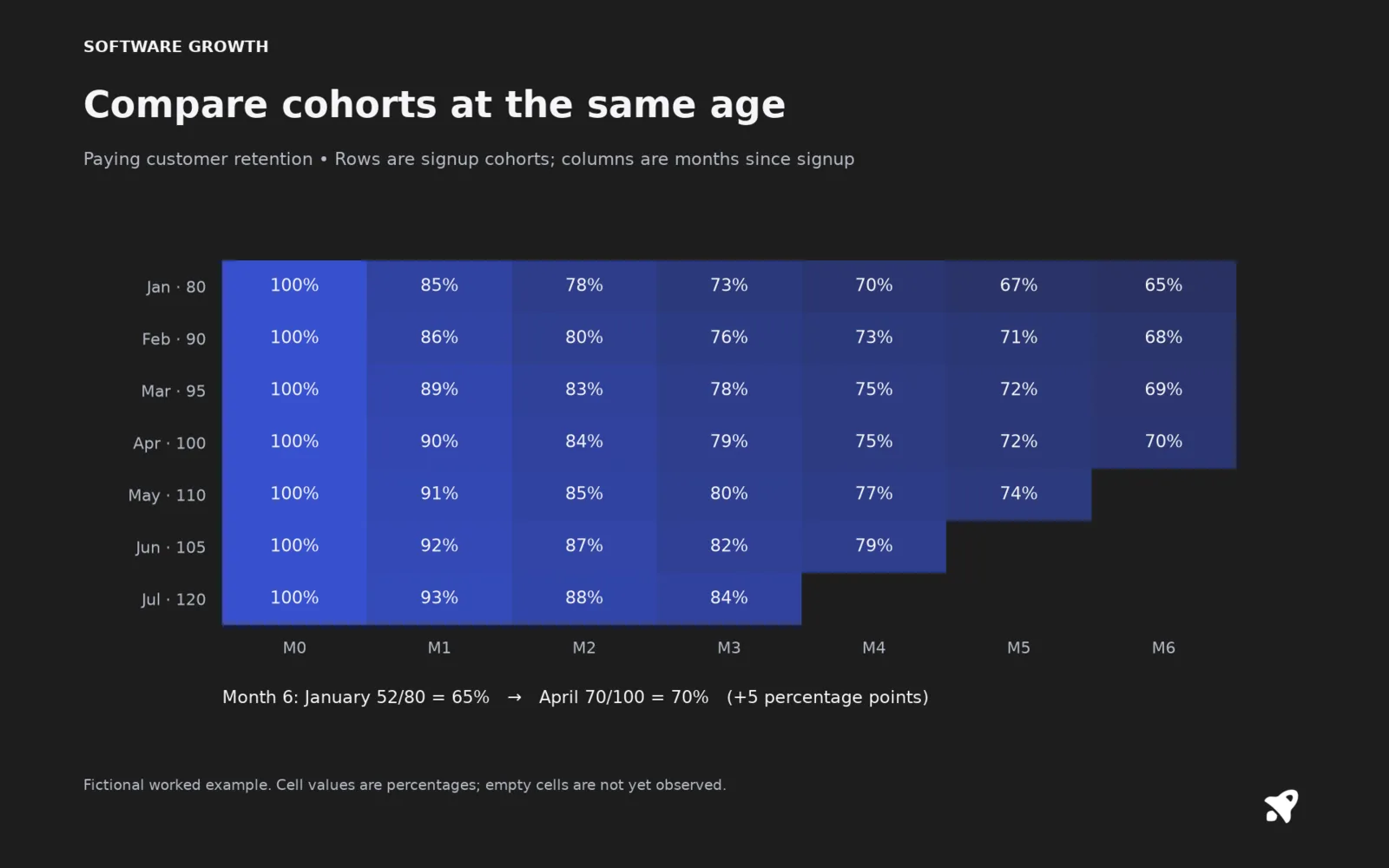
A cohort is a group of customers who started in the same period, for example everyone who subscribed in March. Cohort analysis follows each group through its life and lines the groups up side by side. It answers questions an overall average cannot, such as whether customers who joined after your onboarding rewrite stay longer than those before it.
How a cohort table works
ChartMogul groups customers by the day, week, month, quarter or year of their first subscription, and keeps each customer in the original cohort even if they later expand or cancel and come back, as its help documentation explains. Each row is a cohort. Each column is time since signup. Each cell is a metric, usually the percentage of the cohort still subscribed.
Your January cohort has 80 customers and 52 are still paying in month 6, so month-6 retention is 65%. Your April cohort has 100 customers and 70 remain at month 6, which is 70%. The newer cohort is five points better, a sign that changes since January may have worked. A single churn number would not show this.
What you can learn
- When churn peaks. Most products lose the most customers in the first 30 to 90 days. David Skok's SaaS Metrics 2.0 gives an example where first-month churn improves from 15% to 4% as newer cohorts show the effect of fixes.
- Whether changes worked, by comparing cohorts before and after a release, price change or onboarding update.
- Which channels or plans bring customers who stay. Split cohorts by acquisition source or by plan.
- Whether revenue per cohort grows. Net revenue cohorts above 100% show negative churn inside a group.
Cohort versus period views
A period view takes everyone active in a month and calculates one number. A cohort view fixes who is in the group at the start. Period churn can look flat while cohorts are quietly getting worse, because a growing base of new customers dilutes the older ones.
Common mistakes
- Cohorts too small to read. Quarterly groups are better than weekly ones when you sign up 15 people a week.
- Comparing cohorts at different ages. Compare month 3 to month 3, not the latest figure of each.
- Defining the start inconsistently, such as trial start for some groups and first payment for others.
- Reading a cell without checking the customer count behind it.
For small SaaS
You can do this in a spreadsheet with a list of signup and cancel dates. Do it before you pay for a tool. Once you have six or more monthly cohorts, retention curves and lifetime value estimates become much more trustworthy.
Related terms
Sources
- Cohort analysis, ChartMogul Help Center
- SaaS Metrics 2.0: A Guide to Measuring and Improving what Matters, David Skok, For Entrepreneurs
- Retention, Sequoia Capital Data Science Team